Welcome to the 'CODE' end of year exhibition showcasing the talent and
hard work of the 2nd year Extended Diploma Graphic Design students
during their time at Canterbury College.
Click on the students names to the right be redirected to their individual blogs.
'click images for larger view'
Ryan Ansley
Destination - Graphics HND, Canterbury College
Firstly Ryan, a couple of lines about your time on the course?
Katie Annand-Dickinson
Destination - Graphics HND, Canterbury College
So Katie, are you excited about the private show, and what parts in particular?
Two years on the course - best bits?
My three scenes are based on the Story of Noahs ark. They feature the building of the ark, the storm and the animals all packed on the ark. Im pleased with the final outcomes and displayed in the show they look proffesional yet charming.
Name: Callum Rowney
Project: Type
Grade: Merit
Destination: Graphics BA Hons, Christchurch
What was the brief and how did you go about it?
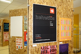
The point of the project was to design a poster for waterstones promoting a typographical book, I chose helvetica - Homage to a typeface. I chose this book as i'm a big fan of helvetica, I enjoy the clean, crispness of the typeface and was inspired by the film Helvetica which featured artists such as Neville Brody and Wim Crouwel.
Which skills have you built upon during this project?
 Researching into Wim Crouwel has taught me about grid systems and how to use them properly, I have built on all my typographical skills such as layout and type setting.
Explain your final design which is up in the show?
The typeface used on my final design is obviously helvetica and includes the light regular and bold styles. I included the swiss flag as this is where the typeface originates and I've included grid lines inspired by wim crouwel, i tried a number of different colours but feel black works best.
hard work of the 2nd year Extended Diploma Graphic Design students
during their time at Canterbury College.
Click on the students names to the right be redirected to their individual blogs.
'click images for larger view'
Yet another stunning photo of Ryan.
Ryan Ansley
Destination - Graphics HND, Canterbury College
Firstly Ryan, a couple of lines about your time on the course?
To be honest it's been a blast, been so enjoyable and i've had a good laugh with some good mates. I've produced work i'm incredibly proud of and cant wait to progress further into the world of graphic design.
Looking forward to the End of Year Show?
OHHHHHH MATE! I cant wait, I think exhibiting my work will help me realise what all this hard works been about and seeing my work up in A1 will make me proud.
Best bits of the course?
After this course i'm going on to HND but will really miss my tutors and classmates on this one, it has been a fantastic experience, a real journey and im pleased to have found my strengths within graphic design.
Katie Annand-Dickinson
Destination - Graphics HND, Canterbury College
So Katie, are you excited about the private show, and what parts in particular?
Yes! very excited, the weeks commencing up to it have involved a lot of hard work from everyone in the class and have been really stressful at times but seeing how great our final work looks and how good the show will be makes it all worth while.
Are you pleased with your Final Designs being put up in the show?
Yeahhhh, seeing them in A1, 2 and 3 in full colour displayed professionally makes me really proud of what i've achieved over the two years.
Two years on the course - best bits?
Made loads of new friends and been on some superb trips, i'm pleased with all my final outcomes throughout the various projects, Lots of banter and having a laugh aswell!
Anything else to say?
Project: Narrative
Grade: Distinction
Destination: Graphics BA Hons, Camberwell
Destination: Graphics BA Hons, Camberwell
Favourite parts of the narrative project?
For me the narrative project was probably my favourite project we were set in the second year, it helped me build and explore my illustration techniques and looking at different artist forced me to experiment with medias i don't usually use.
Which artists did you research into and how did they influence your work?
The two artists I took a particular interest in where Quentin Blake and Thao Lam, the final illustrations I produced are inspired by the style of Thao Lam. She uses stylized abstract shapes to create collage scenes, to make the shapes I sourced fabric and textures from both the studio and internet then used a clipping mask to produce animals and objects.
My three scenes are based on the Story of Noahs ark. They feature the building of the ark, the storm and the animals all packed on the ark. Im pleased with the final outcomes and displayed in the show they look proffesional yet charming.
Project: Type
Grade: Merit
Destination: Graphics BA Hons, Christchurch
What was the brief and how did you go about it?
The point of the project was to design a poster for waterstones promoting a typographical book, I chose helvetica - Homage to a typeface. I chose this book as i'm a big fan of helvetica, I enjoy the clean, crispness of the typeface and was inspired by the film Helvetica which featured artists such as Neville Brody and Wim Crouwel.
Which skills have you built upon during this project?
Explain your final design which is up in the show?
The typeface used on my final design is obviously helvetica and includes the light regular and bold styles. I included the swiss flag as this is where the typeface originates and I've included grid lines inspired by wim crouwel, i tried a number of different colours but feel black works best.
Name: Paige Dennis
Project: Safeguarding poster
Grade: N/A
Destination: Employment/Apprenticiship
Destination: Employment/Apprenticiship
Why did you create this poster?
My class got asked by Canterbury college to each design a poster to promote safeguarding. It had to be a poster showing exactly what safeguarding was but yet had to be effective so it would get people's attention, my poster got chosen out the whole class to be put up around college.
How did you come up with the idea?
I created a mind map about safeguarding to come up with as much information as possible to help me create the poster. I wanted the poster to be in black and white with as little colour as possible as i felt this was more effective and makes it more striking. The idea of writing on the hands of the girl came up through a discussion with a peer.
Do you feel this is an effective design?
I feel my design is very effective, it catches people's eye which is what I was aiming for. You can find all these posters up around college.
Name: Jorin Perry
Project: Student union- FMP
Grade: Pass/Merit
Destination: Graphics HND, Canterbury College
What was this project all about, what was your aim?
This project is to rebrand the students union, my aim was to create a new surface graphics to help promote and improve on the already existing graphics.
How did you create your final piece?
After much research, idea generation, talking to students and meetings with the SU i felt that bright and random colours was needed to help show diversity and equality in this college. the black background was to really make the colours and type pop out.
Did you enjoy the project?
Yes i had a great time and really enjoyed the interaction with all of the students and talking with the people of the SU and really got a feel of how much the students' union helps and wants to help the student of canterbury college
Name: Ryan Ansley
Project: Retro
Grade: Pass
Destination: Graphics HND, Canterbury College
What was the project about?
In the Retro Project, we had to look at a range of existing brands and then we had to advertise them in a retro style. As part of this project we learnt about the grafitti artist Shepard Fairey and his famous Obama poster campaign. I recreated a self portrait in his style.
What artists did you research into?
I chose Shepard Fairey because his work really appeals to me and i really like some of the album covers he has created especially the one for The Black Eyed Peas. His work is bold, simple and really eye-catching.
Explain your final outcomes?
One of my designs was a remake of Fairey's Hope Poster. I took a picture of myself and then followed the exact process that he would have used. I was really pleased with the outcome and thought it was one of my best pieces.
 I looked into the illustration style of Austrian artist Hundertwasser. His work is quite abstract yet really effective and graphical so I researched into a variety of his pieces. These then inspired me to develop my ideas further to create the background design.
18/06/12- The show is up!

What was the project about?
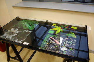
This was a personal project i got asked to do by the college, they asked me to take some photos for the their canteen to make it a nicer environment to sit and eat. They originally said for me to take nature photos in any style i chose, so I decided to take inspiration from HDR (High Dynamic Range) photography.
What artists did you research into?
I didn't research into any photographers because I prefer to keep my work my. Although, I did use HDR techniques to edit these images to give them more vibrancy and to bring out the detail in smaller areas.
Explain your final outcomes?
 These finals are probably four of the best photos I've taken this year. I use HDR in most of my work because it's a rare form of editing and when done to a professional standard can look absolutely amazing. All four of these outcomes were taken in my garden and edited during my spare time at home. I am very proud to see my work exhibited in such a professional way and look forward to future exhibitions that show my work.
In the Retro Project, we had to look at a range of existing brands and then we had to advertise them in a retro style. As part of this project we learnt about the grafitti artist Shepard Fairey and his famous Obama poster campaign. I recreated a self portrait in his style.
What artists did you research into?
I chose Shepard Fairey because his work really appeals to me and i really like some of the album covers he has created especially the one for The Black Eyed Peas. His work is bold, simple and really eye-catching.
Explain your final outcomes?
One of my designs was a remake of Fairey's Hope Poster. I took a picture of myself and then followed the exact process that he would have used. I was really pleased with the outcome and thought it was one of my best pieces.
Name: Charles Robinson
Project: Retro
Grade: Pass
Destination: Graphics HND, Canterbury College
Favourite parts of the retro project?
Doing the doodles for the background of my Coke poster. I really like doing detailed illustrations like these. They weren't originally for the background of this poster however, after overlaying the Coke bottle over the doodle it looked a lot better. Then I simply changed the doodle and coke bootle to red and white to match the company image.
Which artists did you research into and how did they influence your work?
Explain your final design which is up in the show?
My coke bottle design has a Hundertwasser illustrated background. It is very simple in red and white yet I feel it is effective in promoting the product.
18/06/12- The show is up!
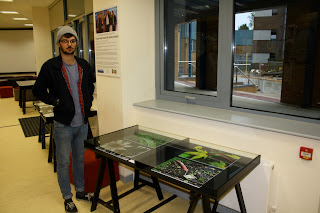
Glass topped tables to display our work.
Glass cabinet holding all the packaging mock ups.
Various examples of Code signage
Finally....evidence that Ryan and Charles are actually doing some work!
What was the project about?
This was a personal project i got asked to do by the college, they asked me to take some photos for the their canteen to make it a nicer environment to sit and eat. They originally said for me to take nature photos in any style i chose, so I decided to take inspiration from HDR (High Dynamic Range) photography.
What artists did you research into?
I didn't research into any photographers because I prefer to keep my work my. Although, I did use HDR techniques to edit these images to give them more vibrancy and to bring out the detail in smaller areas.
Explain your final outcomes?


